Project 1 Research: Museum Promotional Design
- Kaley Fitzpatrick

- Feb 17, 2021
- 3 min read
Updated: Feb 24, 2021
To figure out how to design a Promotional Design, I also have to understand Branding. Through skimming the beginning of the Branding textbook, I've come to understand I need to know what this company or event is to stand for, what message do we want to send out to the audience. And how do I convert that idea towards someones art work and promotion to see their exhibition. Well to clearly understand the basic message of Takamatsu's architecture and his ideas, and using that to target the audience, might be an effective way to grab one's attention. But for now let's go into different kinds of promotional designs for museums and other events.
Theme:
Having a common theme to spread through out the many promotional items will allow the objects to all properly tie together. This can be shown through similar formatting of image and text, a distinct color palette, similar shapes/illustrations, etc. Also for promotional designs, the theme/design should not outshine the object or information we are putting out there. But instead support the work/ideas.
COLOR: Having a set of colors to use across the design, is the best option to keep the promotion together, Having around 3-6 colors I think is the safest range. I know black and white is very common for easy reading, but playing with good color palettes that work with or enhance the artists work is always favorable.
SHAPES&LINES: Are a great way to connect images and text, or to fill in a negative space. Its allows the designer to be able to play with cropping and layering more. Having cropping and layering give depth to what could be a flat amount of information. Might bring the audience into read the information more.
TEXT: Of course it is very very important. The most useful/impactful/important part of text is how to properly space/format/align the text on the objects and design. Text that do not have a set of rules for margins and whatever might make the readers job more difficult.
SPACE: Honestly playing with space and placement is one of the most challenging, but most experimental thing a designer can do. I think having a welcoming and friendly use of space allows the audience to read easier, however having slightly experimentation catches the attention and makes it stand out from regular layouts.
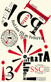
EXAMPLES OF PROMOTIONAL DESIGN FOR MUSEUMS:


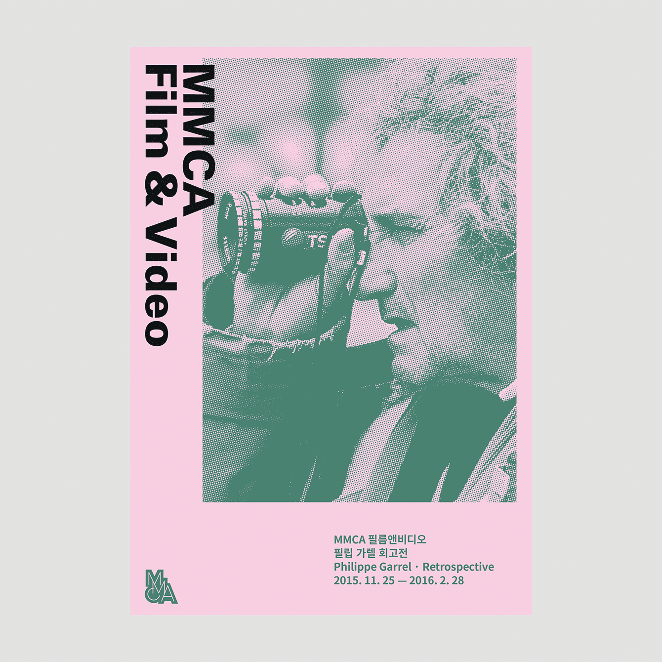


The Whitney ones especially show a very common theme shown throughout all their promotional designs, very good at tying everything together, while still expressing unique works and information. Additionally it accomplishes this goal with very simple and set guide for their designs, not allowing it to outshine the art, while also not being too bland.
I greatly enjoy the color contrast these museums display to grab attention.
I also really like how some of them really express the personality of the artist or their work through the pamphlets, lets the audience understand what their work holds.
INSPIRATION:


I think that cropping or layering different elements over each other to create something new, goes well with Takamatsu work, and could be a potential idea or trial to take into consideration.
This project connects to our project from VCDS 1, where we created a logo for a NBO, then created promotional merchandise. It's similar in away that people need to be aware of what is being offered or shown, but spread through a variety of ways.
I think starting off on one design idea for one object first, like the brochure, and than seeing if that idea can play into posters, banners, etc. will allow the designer to play with possibilities of design.
Links:

Comments