Project 2: Research
- Kaley Fitzpatrick

- Oct 10, 2020
- 4 min read
My story is a horror, mystery, thriller, supernatural, and other related fields. I wanted to go in the direction of B-film posters, 1990's-80's horror/slasher films, 1930's-20's horror film posters and typography posters. While also exploring some book covers from my childhood or that display a good use of type or composition/illustration. Below are all examples and inspirations I hope to take when making my own book cover.
1990's-80's Horror/B-Film Posters


I really enjoy posters, mainly movie posters, and some posters that I think have a lot of fun when it comes to illustrations, composition, or imagery are horror movie posters. When looking at the above examples one can obviously get a sense of what the movie will hold, and what kind of horror movie it is, from slasher to creature feature. Above many colors used are black, red, green, dark purple/blue, and some yellowish orange. Normally the backdrop is black, with the other colors popping off or glowing from the darker background. These colors together give that sense of horror, mystery, violence, and darkness I want from my films. Besides color, the typography on the horror posters slightly vary depending on the type of horror film it is. On slasher films the type is normally a decorative type drawn with either blood or knife like cuts; while also using san serif/written font for more information or rest of the title. Then the creature feature like films use sharper more angular type faces, or textured/bold decorative type faces. The imagery/illustrations used the posters all demonstrate what to expect from the film, a knife to show a slasher, the monster to show whatever will be terrorizing the people, and screaming people to show fear.
1930's-20's Horror Movie Posters


When looking at these above horror movie posters from the 1930-20, many similarities can be seen to the 1980-90 movie posters. However what I really enjoy from these above posters is the way they illuminate and color the illustrations. I really enjoy the geometric form of coloring/shading. I also enjoy the way they use different tones to cast shadows and light besides from normal skin tones. Another thing to notes is the use of geometric shapes they use to draw parts of their composition in order to put everything together, while also playing or contrasting really well with the typography. The typography on the above posters all play with angle, perspective, and curves. Each poster either has different type faces from decorative, san serif, and cursive. But what is more unique about these typefaces is the way they play the direction of the words. A large majority of them do not sit on a straight line, but instead angle upwards, curves, or the perspective changes; so that you may be viewing it from above or below. This makes the type become more playful with the rest of the composition, and I wanna try to incorporate that idea into my book covers.
1930's-20's Typography/Posters


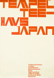


Now I know these vintage posters are not of the horror category, but I do think they are great use of typography, shapes, color, and overall compositions. I really really really like the use of layering of geometric shapes with the experimental, scripture, and san serifed. Most of these posters really play with lines, line weight, shapes, images, and type to create almost an illusion of collage and depth. I really enjoy the way the type is stacked and scaled in different proportions to show more layering and depth. I think the different angles and shaping of the text really gives more to the compositions and mimic what they are doing with the lines and shapes. The colors on the posters also stick with around the same 3 to 4 colors in order to keep the composition unified. Though these colors are all really great on the posters, I think maybe finding 4 colors to use in my book cover, that show horror might be a fun and challenging way to unify the elements.
Book Covers (Horror/Mystery/Supernatural/Adventure or Read growing up)


The above examples are classic books of my childhood that I gravitated towards. The Goosebump books are an iconic symbol for the 90's and 2000's kids who read them or grew up watching the tv series. All of these books have the title of the novel centered on top/bottom of the covers, with the images being in the center. The Goosebumps novels all have an iconic border around them that either is a straight line or a goops into the image. Their iconic type face is a decorative goopy slime that can either be angled straight or slightly tilted back to show depth. The other horror book covers are mainly black, white, gray scale. They typography is normally hand written and then has a supporting serifed type face. The Ender's Game book cover(even though it isn't horror) shows a fun way to use type with it being re formed to go around the sphere/planet. All of these, though not the best, are showing very simple ways to attract the attention of the reader when viewing the book cover first.
Interesting use of Type on Book Covers


So above are some fun examples I found of typography used on books, beside one poster, that I think could be explored. Some show very simple ways to play with regular san serifed typefaces; like bleeding down letters, but not all just a few and the rest helped shaped the bleed. Other ones play with the idea of scale and different fonts to give a sense of collage. I also really like the way they stack, and shape the direction of the words in order to use the space differently, while also giving direction. Overall I think these are all very fun ideas that give me some inspiration on how to play with type and break out of the same idea.


Comments